Huawei · London HMI Lab · 2025
Huawei Calendar
From a simple scheduler into a contextual companion.
The project asked how Huawei Calendar could move beyond conventional event scheduling by incorporating ideas from the Intent-first System, chronobiology and personal wellbeing.
- My role
- UX research and synthesis, product ideation, low-fidelity wireframing and high-fidelity UI design
- Scope
- Collaborative product redesign and concept exploration
Redefining Huawei Calendar
Our brief was to research the Calendar app and the wider time management and scheduling space, identify user frustrations, and explore how Intent-first System ideas could improve or create new experiences. Existing complaints included sync issues, poor interoperability, limited integration, usability problems and missing features.
The team examined those problems, then looked beyond fixes. My work spanned research synthesis and concept exploration through to the low- and high-fidelity mobile UI.
Not Just a Scheduler
Desk research drew on user-generated content, academic and industry papers, and expert commentary. Alongside known Calendar complaints, we found a growing interest in services centred on wellbeing, mindfulness and biological rhythms. This led to three connected directions: an AI-considered structure, wellbeing and chronobiology.
By leveraging IFS, the proposal moves the calendar from a simple scheduler towards a contextual companion: one that helps people shape their day around their internal rhythms and intentions, not just external obligations.
A More Intentional Structure
“For AI to improve the calendar app, the calendar app needs intentional structure and the AI needs room to express itself.” The team therefore reconsidered how people move between timeframes, views and event management. The proposed layout removes the timeframe tabs from the top, brings overlapping sidebar and overflow actions into one place, and adds a switch between Chronological, Agenda and Health views.
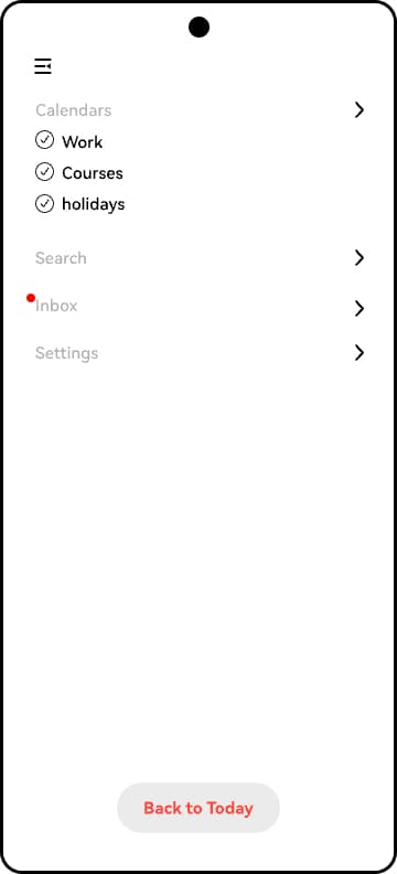
I translated this structure into low-fidelity screens, working through navigation, search, event creation and view changes. The unified sidebar brings calendar management, search, inbox, settings and a return to today into one predictable route.
Not All Events Are Equal
Events have different characteristics: some have a fixed time, some can move, some involve other people, and others are suggestions from the system. I designed an event language to make these differences legible in the calendar itself.
A solid left border grounds an event to a set time; ungrounded items have no such anchor. A dotted extension shows how far a rolling event can move. Collaborative events use borders on both sides, while suggested events are lighter, hollow and rounded to distinguish them from events created by the user. Colour adds another cue, including blue for rolling events, purple for planned sequences and teal for contextual events.
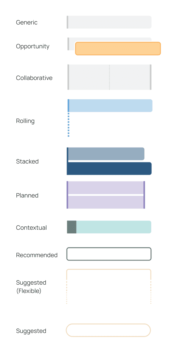
Rolling
A grounded event with room to shift within a sensible timeframe.
Planned
Sequential, grounded parts shown as equally important.
Contextual
An event connected to external context, with its cue in the grounding border.
Suggested
A lighter, hollow treatment signals an AI suggestion rather than a user-created commitment.
Different Ways of Planning
The three views give the same events different contexts. I developed the interface explorations to show how each could support a particular planning task, rather than adding another layer of information to one crowded timeline.
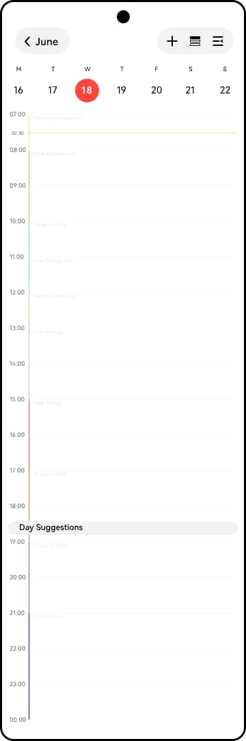
The default timeline places events alongside proposed rhythm and energy states, so a day can be read in relation to personal patterns.
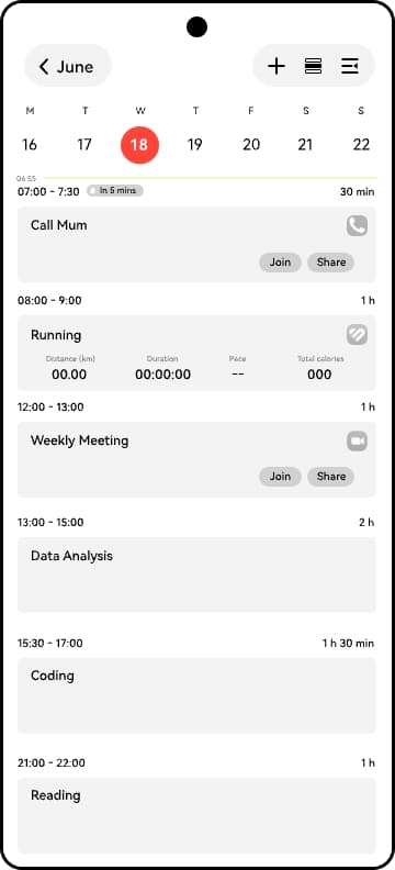
Upcoming events become cards in order, skipping unused time. The proposal explores relevant controls inside each card.
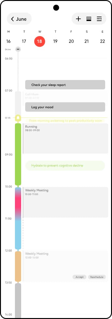
Health insights add rhythm changes, wellbeing suggestions and possible clashes between an event and an energy state.
Moving Between Today and the Bigger Picture
The day is the default timeframe. Past events fade, the “now” line takes on the colour of the current rhythm, and free time is dilated as a dotted line.
In the week view, events stack per day. The month view surfaces goals created by the user or suggested by the system, alongside insights about trends and considerations. The year view shows entire months at a glance and lets people select a month to go into.
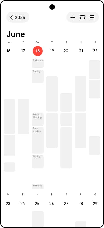
Events are grouped per day so the week can be scanned without reading a continuous timeline.
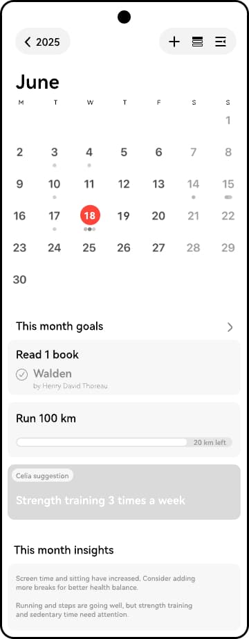
The month places goal suggestions and considerations below the calendar grid.
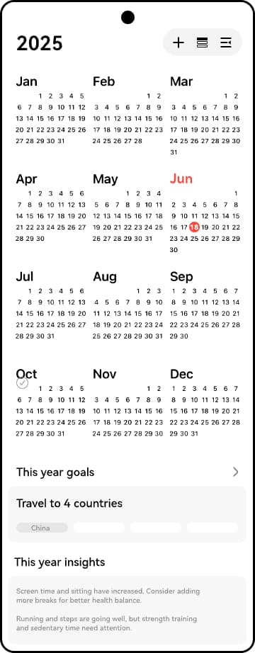
Months appear together, with a route back into a selected month.
Making Room for More Than Events
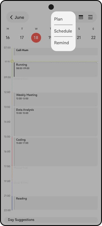
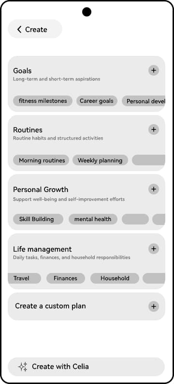
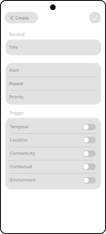
The Create menu presents different verbs for different tasks. Plan is for long-term, complex or multifaceted entities beyond events and reminders. Schedule creates single or recurring events with AI assistance; Remind defines a reminder with more complex triggers.
I designed the Plan entry screen around the four proposed templates—goals, routines, personal growth and life management—plus a custom option. The screen also offers suggested starting points and a way to discuss a plan with Celia.
From Managing Events to Planning With Assistance
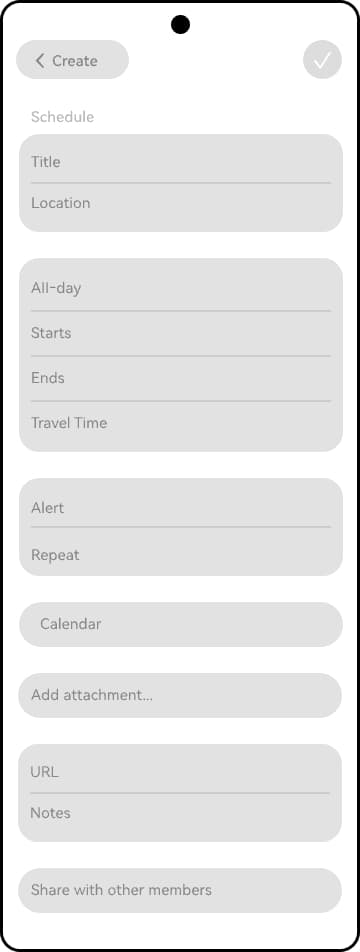
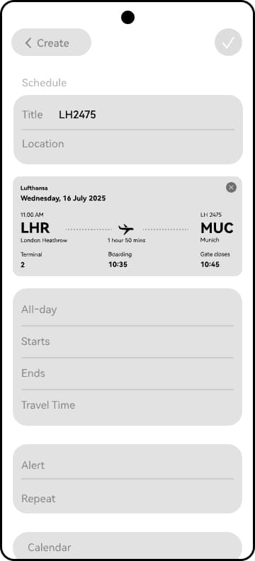
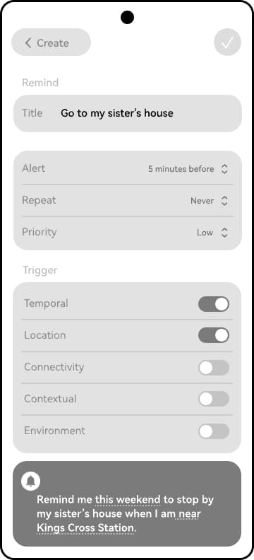
Schedule contains the expected fields for an event and adds suggestions based on what the user enters. Remind is a separate creation screen, rather than another tab within event creation. I designed the event form, flight confirmation state and reminder trigger screens.
Intelligent scheduling
Enter a flight number in the event title and the proposed screen shows the flight information. Once the user confirms the match, the fields can be filled for them. The proposal also suggests shifting times based on rhythm, mental health or attendee availability.
Reminders with meaningful triggers
Reminders can use temporal, location, connectivity, contextual and environmental triggers, including combinations with AND logic. A natural text summary shows the resulting rule; its slots can be changed directly. The proposal also explores entering a trigger in natural language.
Connecting the Assistant to What Is on Screen
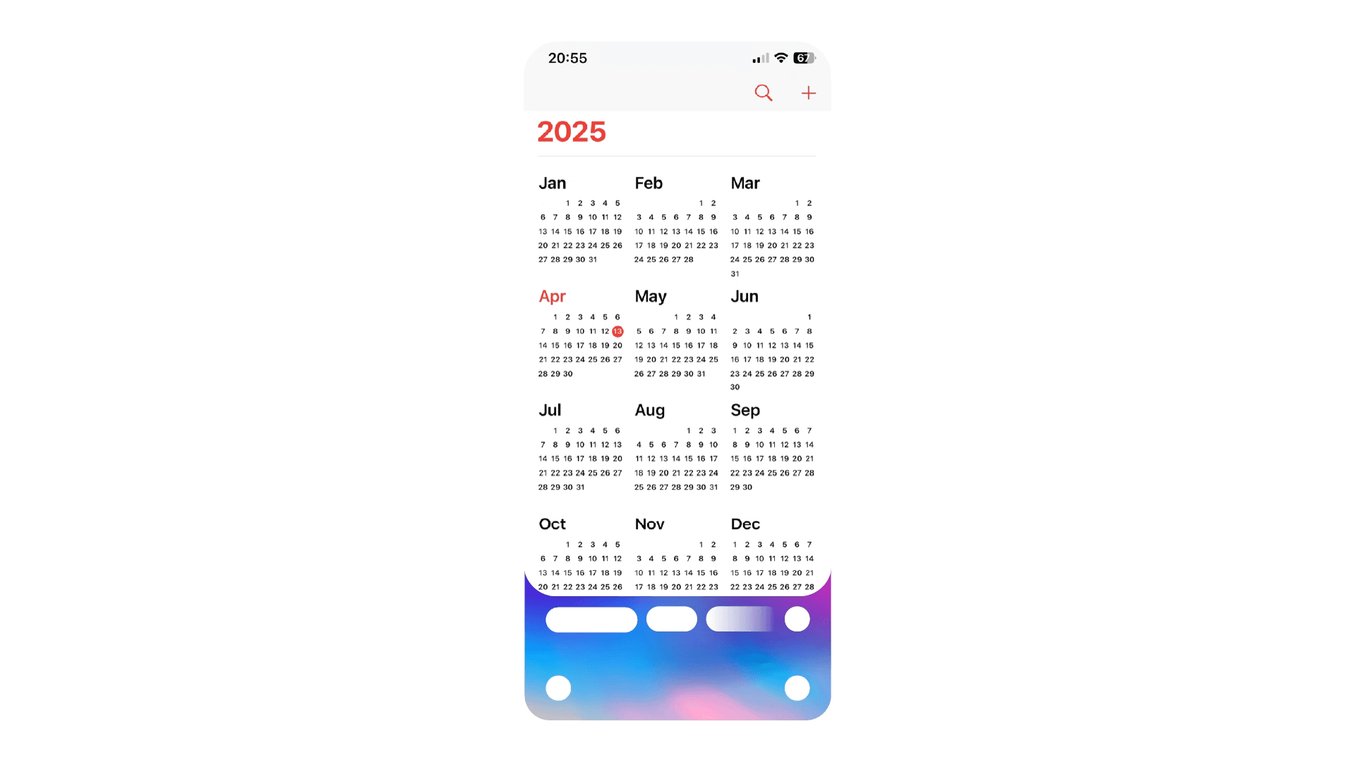
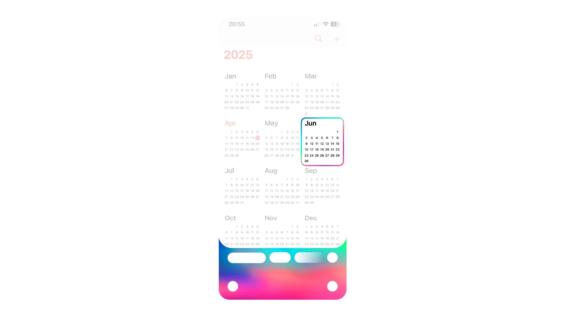
Celia currently appears as a floating element above the app, visually separating it from the content. The proposal asks how its appearance should change if it gains on-screen awareness: Celia could be layered into the Calendar interface, with the entire drawer animated when it is invoked.
I designed the proposed invocation and selection states. With Celia active, a selected calendar element is highlighted so the user can talk about that specific item with the assistant. On-screen awareness and these interactions remain proposals.
From Research to a Product Proposal
The proposal brought together a research-backed direction, simplified navigation, a more expressive event system, views across different timeframes, and new ways to plan, schedule and set reminders. Through wireframes and detailed UI design, I made the team's product ideas tangible as a mobile experience.
Huawei HMI Headquarters adopted the proposal for the next Calendar update. The work shown here is the proposal; its individual concepts should not be read as shipped features.